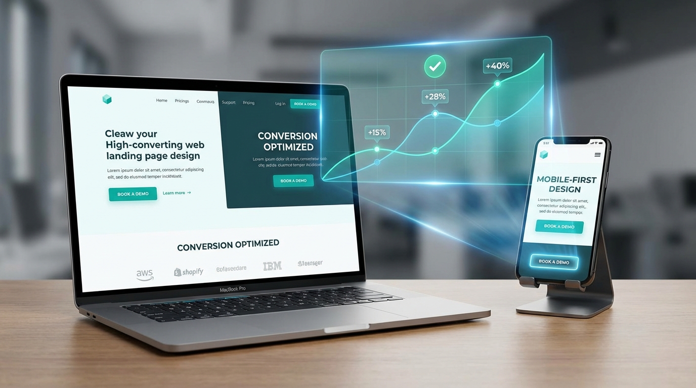
The Post-Click Problem Costing You 76% of Your Ad Spend
You've crafted the perfect ad campaign. Your targeting is dialed in. Click-through rates are strong. Traffic is flowing.
Then visitors hit your landing page.
And 76% of them leave without converting.
Here's why that happens. And more importantly, here's how to fix it.
The 3-Second Message Match Test
Your visitor just clicked an ad promising "50% Off Premium Dog Food Delivery." They land on your page expecting exactly that offer.
Instead, they see a generic homepage. Or worse, a landing page about cat food.
This disconnect—called message mismatch—kills conversions instantly. Because the visitor's brain performs a split-second calculation: "This isn't what I clicked for. I'm leaving."
The solution is simple: Your headline must echo your ad copy word-for-word. If your ad says "Get 50% Off Your First Box," your landing page headline should say exactly that. Not "Welcome to PetFood Plus" or "Save Money on Dog Food."
Match the message. Match the visual. Match the offer. Every single time.
What Happens Above the Fold Determines Everything
Visitors don't scroll to find out if your page is worth their time. They decide in 3 seconds based solely on what appears before they scroll.
Above the fold must include five elements:
A headline that matches your ad (we covered this). A subheadline explaining the benefit in 10 words or less. A hero image or video showing the product or result. Social proof like "Join 47,000+ happy customers." A clear call-to-action button in a contrasting color.
That's it. Everything else is secondary.
Notice what's missing? Navigation menus. Multiple offers. Lengthy explanations. Sidebars. These create what conversion experts call "leaks"—escape routes that let visitors leave without converting.
Remove the leaks. Keep visitors focused on one action.
The CTA Button That Increased Conversions 32%
"Submit" is the worst call-to-action ever written.
It's vague. It's passive. It tells visitors nothing about what happens next.
Compare these:
- Submit vs. Get My Free Guide
- Click Here vs. Show Me How to Save $1,200
- Sign Up vs. Start My 30-Day Trial
The second option wins every time because it's specific. It tells visitors exactly what they'll receive and when they'll receive it.
The best CTA buttons follow this formula: [Action Verb] + [What They Get] + [Time Frame or Benefit].
"Start Saving Today." "Get Instant Access." "Claim My Discount Now."
One software company changed their button from "Request Demo" to "See It In Action" and conversions jumped 32%. Same page. Same offer. Different button copy.
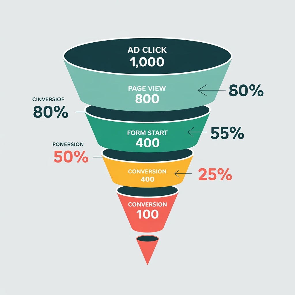
Form Fields: Every One Costs You 11% of Conversions
Each form field you add reduces completion rates by approximately 11%.
This creates a tension: You need information to qualify leads, but you need conversions to have leads at all.
The solution depends on your price point and sales cycle.
For low-cost products or simple offers, ask for email only. You can gather more information later through email sequences or post-purchase surveys.
For high-ticket B2B offers, you can justify asking for company name, role, and phone number because qualified leads matter more than volume.
But never ask for information you don't need immediately. "How did you hear about us?" can wait. "Company size" can wait. "Mailing address" definitely can wait.
One financial services company reduced their form from 11 fields to 4 and saw lead volume increase 120%. Yes, they got less information per lead. But they got three times more leads to work with.
Mobile Isn't Optional—It's 63% of Your Traffic
Most paid traffic now comes from mobile devices. Yet most landing pages are still designed for desktop first.
This shows up in three conversion killers:
Tiny tap targets. If your CTA button is smaller than 44x44 pixels, mobile users will misclick and get frustrated. Make buttons finger-sized.
Forms that require typing. Mobile keyboards are clunky. Use dropdown menus, radio buttons, and checkboxes wherever possible. Enable autofill. Never disable paste functionality.
Slow load times. Mobile connections are slower than desktop. Every second of load time reduces conversions by 7%. Compress images. Minimize code. Remove unnecessary scripts.
Test your landing page on an actual phone with a 3G connection. Not on your desktop browser resized to mobile dimensions. A real phone, with real network conditions, using your thumb to navigate.
That's the experience 63% of your visitors have.
Page Speed: The 3-Second Rule That Costs Millions
If your landing page takes longer than 3 seconds to load, 53% of mobile visitors abandon it.
They don't wait. They don't give you a second chance. They hit the back button and you've paid for a click that never had a chance to convert.
Google's research shows that as page load time goes from 1 second to 5 seconds, bounce probability increases 90%. From 1 to 10 seconds? Bounce probability increases 123%.
The fixes:
Compress images to under 200KB each. Use tools like TinyPNG or ImageOptim. A hero image doesn't need to be 5MB to look sharp.
Enable browser caching so returning visitors load pages instantly. Your hosting provider can set this up in minutes.
Minimize HTTP requests by combining CSS files and reducing third-party scripts. Every Facebook pixel, tracking code, and chat widget adds load time.
Use Google PageSpeed Insights to identify specific bottlenecks. It provides a scored report and tells you exactly what to fix first.
One e-commerce company reduced load time from 6.2 seconds to 2.1 seconds and saw conversion rates increase 41%. Same page. Same offer. Just faster.
Trust Signals: Why Visitors Need Permission to Convert
Visitors don't trust you yet. They just met you 12 seconds ago when they clicked your ad.
Before they'll give you their email or credit card, they need evidence that you're legitimate.
Trust signals provide that evidence:
Customer testimonials with photos and full names. "Great product! - John" means nothing. "This software helped us close 23% more deals in Q1. - Sarah Mitchell, VP Sales at TechCorp" means everything.
Security badges near forms and payment buttons. Norton, McAfee, and SSL certificates reduce form anxiety. They signal "your information is safe here."
Money-back guarantees stated clearly. "30-Day Money-Back Guarantee - No Questions Asked" removes purchase risk. Make it prominent, not buried in fine print.
Real numbers, not rounded estimates. "Join 47,284 subscribers" beats "Join thousands." Specificity signals truth. Round numbers signal marketing fluff.
Media mentions and certifications. "As Featured In: Forbes, TechCrunch, WSJ" borrows credibility from recognized brands.
Place trust signals throughout your page, especially near conversion points. When someone is deciding whether to click your CTA button, a testimonial right above it can tip the scales.
A/B Testing: The Only Way to Know What Actually Works
Everything I've told you is based on data from thousands of tests across millions of visitors.
But here's the truth: Your audience might be different.
The only way to know what works for your specific offer, audience, and price point is to test it.
Start with high-impact elements:
Test headlines first. This has the biggest impact on conversions. Try benefit-focused vs. curiosity-driven. Specific vs. broad. Question vs. statement.
Test CTA button copy and color. Green vs. orange vs. red. "Get Started" vs. "Start Free Trial." Above the fold vs. multiple buttons throughout.
Test form length. Remove one field at a time and measure impact on both conversion rate and lead quality.
Test social proof placement. Above the fold vs. near the CTA vs. dedicated section. Testimonials vs. logos vs. statistics.
Run each test until you have statistical significance—usually 100+ conversions per variation. Don't call a winner after two days because one version is ahead. Wait for the data.
One marketing agency tested 52 different landing page variations over 18 months. The winning combination converted 4.3x better than their original page. They didn't get there with guessing. They got there with testing.
The Post-Click Experience Starts Before the Click
Your landing page doesn't exist in isolation. It's the second half of a conversation that started with your ad.
This means optimization begins in your ad copy, your targeting, and your offer structure.
If your ad promises a free trial but your landing page asks for a credit card, that's friction. If your ad shows a product image but your landing page leads with a video, that's cognitive dissonance. If your ad emphasizes speed but your landing page focuses on features, that's message mismatch.
The entire customer journey—from ad impression to conversion—must feel like one continuous experience. Every element should reinforce the decision to take action.
This is why landing page optimization isn't a one-time project. It's an ongoing process of testing, learning, and refining. The best-performing landing pages are never "finished." They're constantly evolving based on data.
Start with message match. Then optimize your above-the-fold section. Add clear CTAs. Implement trust signals. Remove friction from forms. Test everything.
Do this systematically, and your conversion rate will climb. Do it haphazardly, and you'll waste traffic you paid good money to acquire. Track your progress with our free Conversion Rate Calculator.
The choice is yours. Your ads are bringing people to your landing page right now. Make sure the page is ready to convert them.
Related Guides: Ab Testing Guide, Tracking Setup Guide, Creative Strategy Guide.